UX/UI Projects
American Wildlife Park & Zoo
Project Overview
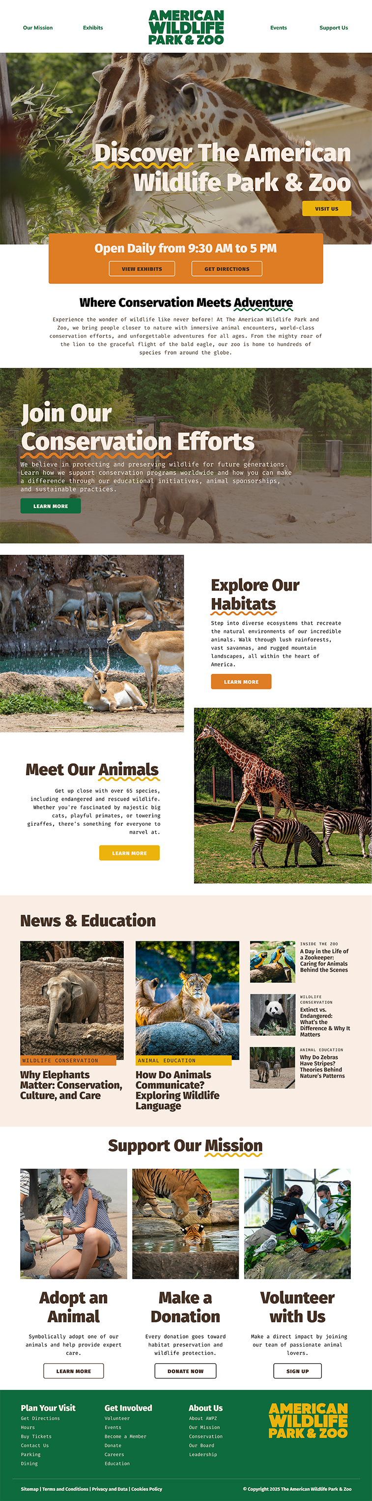
This project was completed as part of my Digital Design Certificate program, where I was tasked with developing a cohesive, user-friendly website that clearly communicated a brand’s mission and identity. I chose to create a website for a zoo, giving me the opportunity to explore how branding, typography, color, imagery, and user experience could work together to create an engaging digital experience for visitors of all ages.
Branding & Visual Identity
I began the project by developing the zoo’s logo and overall brand identity. I selected a fun, vibrant color palette to reflect the energy and youthful personality of the zoo while still creating an experience that would appeal to a broad audience. For the typography, I paired a bold display font for headings with a clean, approachable body font. This created visual hierarchy while maintaining readability and reinforcing the playful character of the brand.
Website Design & User Experience
Once the visual identity was established, I moved into the website design process using Figma. I began by creating wireframes to establish the structure and hierarchy of the site before developing the visual design.
My goal was to create an experience that felt clean and modern without losing the fun personality of the brand. Because the animals are the primary attraction, I made photography a central element of the design and intentionally incorporated large image areas throughout the site. I balanced these visual elements with the practical information visitors would need when planning a visit.
I also considered the user journey when determining the placement of key information. Zoo hours were positioned prominently near the top of the page so visitors could quickly find essential information. A welcome message was placed below to introduce visitors to the experience and establish a friendly tone.
Accessibility was also an important consideration throughout the design process. I incorporated high-contrast color combinations and clear typography to improve readability and ensure the website could be easily viewed and navigated by a wide range of users.
Skills Demonstrated
This project allowed me to apply skills in brand identity development, color theory, typography, wireframing, UI design, user experience, Figma, visual hierarchy, and web accessibility. More importantly, it challenged me to think beyond how a website looks and consider how each design decision supports the brand and helps users find and interact with information.
Tahoe
Project Overview
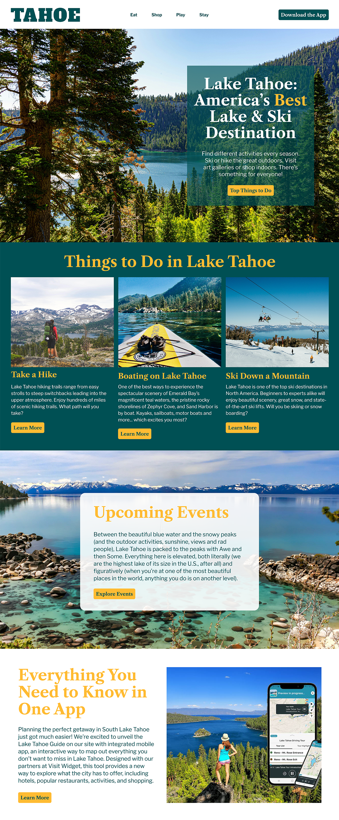
This project was completed as part of my Digital Design Certificate program, where I was tasked with designing a tourism website for Lake Tahoe and adapting the experience for mobile devices using Figma. While the content and logo were provided as part of the assignment, I was responsible for developing the visual direction and creating a responsive design that maintained consistency across both desktop and mobile.
Visual Direction
I developed a color palette inspired by the natural colors of Lake Tahoe, using tones that reflect the lake and surrounding environment. My goal was to create a visual style that felt clean, calming, and connected to the destination while allowing the provided content and imagery to remain the focus.
Responsive Design & User Experience
A major focus of this project was determining how the desktop layout could translate effectively to a smaller screen without sacrificing important information or the overall feel of the website. I designed the layout with simplicity and clarity in mind, creating a structure that could adapt to mobile while maintaining a cohesive visual identity.
The primary goal of the website was to promote the Lake Tahoe tourism app, so I made the app a prominent feature in both versions of the design. For the mobile experience, I added a dedicated banner with a clear call-to-action at the top of the page, ensuring visitors would immediately see the option to download the app when accessing the site.
I also adjusted typography, spacing, and content placement for the mobile layout to ensure that text remained easy to read and information was accessible without overwhelming the smaller screen. Rather than simply scaling down the desktop design, I considered how the hierarchy and layout needed to change to create a more intuitive mobile experience.
Accessibility
Accessibility was another important consideration throughout the design process. I selected contrasting colors to create clear separation between text and backgrounds, improving readability across both desktop and mobile layouts. I also considered text sizing and spacing to ensure the content remained comfortable to read on smaller screens.
Skills Demonstrated
This project allowed me to apply skills in responsive web design, UI design, visual hierarchy, typography, color theory, mobile-first considerations, accessibility, and user experience. It also strengthened my ability to take an existing brand and content system and translate it into a cohesive digital experience across multiple screen sizes.